
Here at dluxe we like to put our money where our mouth is. So much of what you read in our magazine are things that we have genuinely tested and invested in ourselves – we’d not recommend it otherwise. So, when dluxe Magazine owners, Kevin and Jonathan Fraser Urquhart, upped sticks and took on a Grade II period property project in which to make their new forever home, it was only natural that they should turn to their own magazine for inspiration – especially when it came to the biggest renovation challenge in their home – the hideous kitchen!
FINDING INSPIRATION
When we first walked in, we both knew this was the house we’d been searching for. It was love at first sight: a period property that was light, bright, brimming with features and that was just waiting to be upgraded – all apart from the dark, dingy kitchen, that is. There’s a problem room in every house and this was definitely ours. Dark red terrazzo tiles from the fifties and a dark brown Hygena kitchen from the eighties proved a period problem. It got worse with dark brown tiles with a painted picnic theme coupled with low, black painted beams and it could definitely be described as an interior disaster zone. The house deserved better.

What it did have going for it, though, was size. L-shaped in format, it was quirky: at one end it boasted a dining space with giant picture window; there was a double height void with rooflight in the middle but at the far corner of the L it was dark with no natural light, made worse by the fact that the ceiling height was lower at this end and the period beams were painted black which made a low ceiling feel even lower.
There were so many design issues to resolve that it was overwhelming. How to make the space work became the prime topic of conversation at the housewarming and for our Pinterest and Instagram searches – speaking of which, follow us @our_old_new_home. We had to get this space right or we’d be letting down the house and the hard renovation work we’d been lavishing on the rest of it, so it was definitely time to call in the experts – the team at Sherwin Hall.
We’d already seen how beautiful Sherwin Hall’s handcrafted kitchens were when we’d visited their new showrooms at Oadby House – on the corner of Oadby’s Parade – but, we’d never looked at them as a buyer before. So, we jumped in the car to have a look properly and of course fell in love immediately with the dark blue and marble shaker kitchen on display – perhaps not the most sensible choice when your kitchen is like a coalpit! Thankfully, showroom manager, Daniella, was there to translate our unique brief into a kitchen design that would suit the grandness of the 16th century house.

Over a cup of coffee, she explained how we could choose literally any colour we wanted, given everything is made to order. Sherwin Hall use Little Greene paints – a brand we’re big fans of and use throughout the home thanks to their exemplary finish – so, there was no reason why we couldn’t inject a bit of colour and personality into our kitchen – plus we knew that this would help give it the wow-factor you don’t get off the shelf.
Going through the showroom, we loved the wood grained, shaker-style doors and engineered handles. The range of clever storage solutions presented also appealed – especially the stunning walk in larder unit, wide drawers and, being the practical one of the two, the giant pull out recycling station, which was hidden neatly away and got me too excited. The next step was to book a design consultation to see how we could make all this work in our home…
GETTING THE DESIGN RIGHT
Sherwin Hall offer a design service that presents you with a full set of to-scale plans as well as a huge amount of inspiration for you to shop around with. But, should you fall in love with the plans like we did and prefer to create your kitchen with them, the price of your design is taken straight off the cost of your kitchen so win, win.
The first thing kitchen designer Amy did on her initial visit to the house was find out more about us and our lives, afterall, the kitchen is where most of us spend most of our time. She asked about our personal style; how we entertained; whether we were proper foodies etc, so she could build a picture of what we’d want from the perfect kitchen both in terms of look and practicality.

Armed with that, it was time to look at the space and the problems (or opportunities) it presented. It was decided that the existing L shaped layout was the most functional, but the positioning of ovens and sinks etc was far from ideal. It was also determined very quickly that wall units were a no-no because of the limited ceiling height. Amy noted the eclectic array of ornaments around the house foraged from our trips to French antique markets and wanted to make sure that there was space for these within the design. All measured up, she would next get in touch with the first-draft designs. We were excited but nervous.
THE DESIGN
We didn’t have to wait long as the designs were ready within a few short days. Amy had returned to the studio and immediately worked on them, as she was so excited to come up with a solution for us. We made an appointment for the next day and returned to the comfortable showroom to sit down and go through the ideas.
Amy guided us through her considered designs on screen. Her focus has been to make the kitchen feel timeless and sophisticated – going too trendy can render it unfashionable very quickly – whilst still making it easy for us to update the look and feel of it through decoration and accessorising.
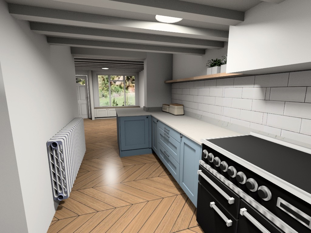
We’d all decided that the best things to do with the dark beams was to paint them out – this is a design tip used to make spaces look taller – but Amy had also opted for a white quartz worktop and Belfast sink to reflect light upwards and expand the space. The sink was also centred to the view from the kitchen table and useful peninsula in order to balance the space. She’d also incorporated our beloved blue into the scheme, painting the units in a softer but more appropriate shade than the showroom model we’d fallen for in order to keep things light and bright – another design tip. Aged bronze engineered handles injected vintage flair. The low ceilings meant wall units would
be too heavy, so a dresser style larder unit was incorporated instead and a floating light oak shelf would wrap its way around the kitchen and provide the perfect place for us to add our own eclectic style and knick-knacks. In the dining space the same units would be used to create an oak topped window seat hiding stacks of storage.

Flooring wise, we had to choose wisely and fell in love with the white painted oak-style floor we’d seen from the new signature range by Quickstep, which would work well throughout with its heavy texture adding vintage charm and waterproof properties providing much needed practicality – plus being white it would also help bounce light.
Everything was coming together. After approving the plans, the next step was to call in the trades, all project managed by the Sherwin Hall team, and to get started on creating our dream kitchen…
Look out for the next issue of Dluxe when we get practical with the project managers!
Quickstep White Painted Oak Flooring costs £29.99 per sq/m. Find out more at www.quick-step.co.uk


